


/*
* ============================================================
* PROJECT CBNEWS — GLOBAL RESPONSIVE CSS
* Paste this entire file into:
* SitePad Editor → Settings (gear icon) → Custom CSS
*
* Breakpoints:
* 480px — small phones (iPhone SE, older Android)
* 600px — standard mobile
* 768px — large mobile / tablet portrait
* 1024px — tablet landscape
* ============================================================
*/
/* ============================================================
1. FOUNDATION — Applies on all screen sizes
============================================================ */
/* Make ALL images responsive by default */
img {
max-width: 100% !important;
height: auto !important;
display: block !important;
}
/* Responsive embeds — YouTube, Vimeo, Google Maps, iframes */
iframe,
embed,
object,
video {
max-width: 100% !important;
}
/* Responsive iframe wrapper (use this class in SitePad HTML blocks) */
.cbn-video-wrap {
position: relative !important;
padding-bottom: 56.25% !important; /* 16:9 ratio */
height: 0 !important;
overflow: hidden !important;
}
.cbn-video-wrap iframe,
.cbn-video-wrap video {
position: absolute !important;
top: 0 !important;
left: 0 !important;
width: 100% !important;
height: 100% !important;
}
/* Tables scroll horizontally on small screens */
table {
width: 100% !important;
overflow-x: auto !important;
display: block !important;
-webkit-overflow-scrolling: touch !important;
}
/* Stop long words and URLs breaking layouts */
p, li, h1, h2, h3, h4, h5, h6, a, span, td, th {
word-wrap: break-word !important;
overflow-wrap: break-word !important;
hyphens: auto !important;
}
/* Audio players full width */
audio {
width: 100% !important;
max-width: 100% !important;
}
/* ============================================================
2. TABLET (max 1024px)
============================================================ */
@media (max-width: 1024px) {
/* Slightly reduce page padding */
.sp-page-content,
.page-content,
[class*="content"] {
padding-left: 20px !important;
padding-right: 20px !important;
}
/* Columns: switch from 3-col to 2-col */
[class*="col-4"],
[class*="col-3"] {
width: 50% !important;
}
}
/* ============================================================
3. TABLET PORTRAIT & LARGE MOBILE (max 768px)
============================================================ */
@media (max-width: 768px) {
/* Body */
body {
font-size: 15px !important;
line-height: 1.7 !important;
}
/* Headings scale */
h1 { font-size: 1.7rem !important; line-height: 1.2 !important; }
h2 { font-size: 1.4rem !important; line-height: 1.25 !important; }
h3 { font-size: 1.2rem !important; }
h4 { font-size: 1.05rem !important; }
h5, h6 { font-size: 0.95rem !important; }
/* All columns go full width */
[class*="col-"],
[class*="sp-col"],
[class*="column"],
.wp-block-column {
width: 100% !important;
float: none !important;
flex: none !important;
}
/* Rows become vertical stacks */
[class*="row"],
[class*="sp-row"],
.wp-block-columns {
flex-direction: column !important;
display: flex !important;
}
/* Navigation: ensure hamburger menu trigger is visible */
nav ul,
.sp-menu ul,
[class*="nav-menu"] ul {
flex-direction: column !important;
}
/* Wider content area */
.sp-page-content,
.page-content,
.entry-content,
.post-content,
article,
.container,
.wrapper {
padding-left: 16px !important;
padding-right: 16px !important;
max-width: 100% !important;
}
/* Featured images */
.sp-featured-image img,
.post-thumbnail img,
.wp-post-image {
width: 100% !important;
height: auto !important;
}
/* Article listings — single column */
.sp-post-grid,
.post-grid,
[class*="post-list"],
[class*="article-list"],
[class*="blog-grid"] {
grid-template-columns: 1fr !important;
display: block !important;
}
/* Article listing cards */
[class*="post-card"],
[class*="article-card"],
[class*="blog-card"],
[class*="sp-post"] {
width: 100% !important;
margin-bottom: 24px !important;
}
/* Sidebar stacks below content */
.sidebar,
aside,
[class*="sidebar"],
[class*="widget-area"] {
width: 100% !important;
margin-top: 32px !important;
float: none !important;
}
/* Press Council badge and trust icons scale down */
.trust-badge img,
[class*="badge"] img,
[class*="logo"] img {
max-width: 120px !important;
}
/* Social feed embeds */
[class*="facebook"],
[class*="twitter"],
[class*="social-feed"] {
overflow: hidden !important;
max-width: 100% !important;
}
}
/* ============================================================
4. STANDARD MOBILE (max 600px)
============================================================ */
@media (max-width: 600px) {
body {
font-size: 14px !important;
}
/* Headings */
h1 { font-size: 1.5rem !important; margin-bottom: 12px !important; }
h2 { font-size: 1.25rem !important; }
h3 { font-size: 1.1rem !important; }
h4 { font-size: 1rem !important; }
/* Header / masthead */
header,
[class*="header"],
[class*="masthead"],
[class*="site-header"] {
padding: 10px 16px !important;
}
/* Site logo — don't let it overflow */
[class*="logo"] img,
.site-logo img,
header img {
max-height: 50px !important;
width: auto !important;
}
/* Navigation menu */
nav,
[class*="nav"],
[class*="menu"] {
font-size: 0.88rem !important;
}
/* Page content */
.sp-page-content,
.page-content,
.entry-content,
.post-content,
article,
main {
padding: 16px !important;
}
/* Paragraphs */
p {
font-size: 0.95rem !important;
line-height: 1.8 !important;
margin-bottom: 16px !important;
}
/* Article meta — date, author, category */
[class*="post-meta"],
[class*="entry-meta"],
[class*="article-meta"] {
font-size: 0.78rem !important;
flex-wrap: wrap !important;
gap: 6px !important;
}
/* Article title on listing pages */
[class*="post-title"] a,
[class*="entry-title"] a,
[class*="article-title"] a,
h2.title a {
font-size: 1.1rem !important;
line-height: 1.3 !important;
}
/* Read more links */
[class*="read-more"],
[class*="more-link"],
a[class*="more"] {
font-size: 0.82rem !important;
padding: 6px 12px !important;
display: inline-block !important;
}
/* Full-width images in posts */
.sp-page-content img,
.entry-content img,
.post-content img,
article img {
width: 100% !important;
height: auto !important;
margin: 16px 0 !important;
}
/* Image captions */
figcaption,
[class*="caption"],
.wp-caption-text {
font-size: 0.75rem !important;
line-height: 1.5 !important;
padding: 6px 0 !important;
}
/* Block quotes */
blockquote {
margin: 16px 0 !important;
padding: 12px 16px !important;
font-size: 0.95rem !important;
}
/* Press Council info box */
[class*="trust"],
[class*="press-council"],
[class*="editorial"] {
padding: 16px !important;
font-size: 0.82rem !important;
}
/* Stats/numbers section */
[class*="stats"],
[class*="counter"],
[class*="numbers"] {
flex-direction: column !important;
gap: 16px !important;
}
/* Contact page fields */
input[type="text"],
input[type="email"],
input[type="tel"],
input[type="url"],
textarea,
select {
width: 100% !important;
max-width: 100% !important;
font-size: 1rem !important;
padding: 10px 12px !important;
}
/* Buttons */
button,
input[type="submit"],
[class*="btn"],
[class*="button"] {
width: 100% !important;
padding: 12px 16px !important;
font-size: 0.95rem !important;
text-align: center !important;
}
/* Footer */
footer,
[class*="footer"],
[class*="site-footer"] {
padding: 24px 16px !important;
font-size: 0.78rem !important;
text-align: center !important;
}
footer [class*="col"],
[class*="footer"] [class*="col"] {
width: 100% !important;
margin-bottom: 20px !important;
text-align: center !important;
}
/* Footer links */
footer ul,
[class*="footer"] ul {
list-style: none !important;
padding: 0 !important;
}
footer ul li,
[class*="footer"] ul li {
margin-bottom: 6px !important;
}
/* Social icons */
[class*="social"] a,
[class*="social-icon"] {
font-size: 1.2rem !important;
margin: 0 6px !important;
}
/* Audio players */
audio {
width: 100% !important;
}
/* Remove excess horizontal margins on mobile */
[class*="container"],
[class*="wrapper"],
[class*="inner"] {
padding-left: 14px !important;
padding-right: 14px !important;
margin-left: 0 !important;
margin-right: 0 !important;
}
/* OnlineRadioBox player widget */
[class*="radio-player"],
[class*="onlineradiobox"],
.orb-player {
width: 100% !important;
max-width: 100% !important;
}
}
/* ============================================================
5. SMALL PHONES (max 480px)
============================================================ */
@media (max-width: 480px) {
body {
font-size: 13px !important;
}
h1 { font-size: 1.3rem !important; }
h2 { font-size: 1.15rem !important; }
h3 { font-size: 1rem !important; }
/* Site logo even smaller */
[class*="logo"] img,
header img {
max-height: 40px !important;
}
/* Full-bleed hero images on tiny screens */
[class*="hero"] img,
[class*="banner"] img,
[class*="featured"] img {
margin-left: -14px !important;
margin-right: -14px !important;
width: calc(100% + 28px) !important;
max-width: calc(100% + 28px) !important;
}
/* Navigation font smaller */
nav a,
[class*="nav"] a,
[class*="menu"] a {
font-size: 0.82rem !important;
padding: 6px 10px !important;
}
/* Tighter spacing throughout */
section,
[class*="section"],
[class*="sp-section"] {
padding-top: 20px !important;
padding-bottom: 20px !important;
}
/* Press Council badge */
[class*="press-council"] img,
[class*="badge"] img {
max-width: 90px !important;
}
/* Reduce blockquote padding */
blockquote {
padding: 10px 12px !important;
font-size: 0.88rem !important;
}
/* Keep buttons tappable */
a, button, [class*="btn"] {
min-height: 40px !important;
display: inline-flex !important;
align-items: center !important;
justify-content: center !important;
}
}
/* ============================================================
6. UTILITY CLASSES
Add these to any SitePad HTML block when needed
============================================================ */
/* Hide on mobile */
@media (max-width: 600px) {
.cbn-hide-mobile { display: none !important; }
}
/* Hide on desktop */
@media (min-width: 601px) {
.cbn-hide-desktop { display: none !important; }
}
/* Responsive video embed — wrap any YouTube iframe with this */
.cbn-embed-wrap {
position: relative !important;
width: 100% !important;
padding-bottom: 56.25% !important;
height: 0 !important;
overflow: hidden !important;
margin: 20px 0 !important;
}
.cbn-embed-wrap iframe {
position: absolute !important;
top: 0 !important;
left: 0 !important;
width: 100% !important;
height: 100% !important;
border: 0 !important;
}
We are a team of professionals working to uncover the truth in every story.
Project CBNews is an online news channel that started off carrying community centric news from the Vaal but grew to cover Gauteng. As an online platform we carry stories from across the globe that fit in with our ethos of humanitarian-centric, edutainment, christian and business news. We are all about telling the good news, upliftment, and bringing hope. We live daily with doom and gloom and do not need to harp on about it.
Meet the Team of Project CBNews
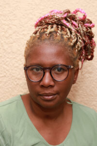
Lindi Tshabangu - Journalist & Events Coordinator
Full Bio:
Lindi Tshabangu is a journalist and events coordinator at Project CBNews, specializing in community engagement and grassroots storytelling.
Specialties:
Community events coverage
Local business profiles
Human interest stories
Social media coordination
Event documentation
Experience:
Co-host, "The Real South Africa" podcast
Community engagement specialist
Business and entrepreneurship coverage
Contact:
lindi@projectcb.online
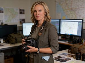
Carlett Badenhorst - Editor-in-Chief & Investigative Journalist
Full Bio:
Carlett Badenhorst is the founder and Editor-in-Chief of Project CBNews, bringing over two decades of multimedia journalism experience to South African community news coverage.
Credentials & Experience:
Honours Degree in Psychology with specialized expertise in organizational behavior and interpersonal dynamics
LPPSA (Licentiate of the Photographic Society of South Africa) - 2022, recognizing technical excellence and creative ability in photography
8+ years in media at Delta Community Church
International journalism assignments including investigative reporting in the Democratic Republic of Congo and Angola
Professional photographer since 2003 , founder of Photos@Carlett Studio (est. 2011)
Specialties:
Investigative journalism
Community accountability reporting
Document-based investigations
Visual storytelling
Faith-based news coverage
Municipal and local government reporting
Other Ventures:
Founder, JustGospel Radio (24/7 online gospel station, 106,000+ monthly sessions)
Founder, Photos@Carlett Studio (LPPSA-accredited photography business)
Freelance investigative journalist
Editorial Philosophy:
Carlett operates under a "Jesus as CEO" philosophy, prioritizing integrity over profit and truth over popularity. Her approach combines rigorous fact-checking with compassionate, humanitarian-focused storytelling.
Notable Work:
CRC megachurch accountability investigation (court document-based reporting)
Vaal Triangle municipal governance coverage
International assignments to conflict zones
Community upliftment and social justice reporting
Contact:
editor@projectcb.online
Twitter: @CarlettBadenhorst

Kalnisha Singh - Financial Journalist
/*
* ============================================================
* PROJECT CBNEWS — GLOBAL RESPONSIVE CSS
* Paste this entire file into:
* SitePad Editor → Settings (gear icon) → Custom CSS
*
* Breakpoints:
* 480px — small phones (iPhone SE, older Android)
* 600px — standard mobile
* 768px — large mobile / tablet portrait
* 1024px — tablet landscape
* ============================================================
*/
/* ============================================================
1. FOUNDATION — Applies on all screen sizes
============================================================ */
/* Make ALL images responsive by default */
img {
max-width: 100% !important;
height: auto !important;
display: block !important;
}
/* Responsive embeds — YouTube, Vimeo, Google Maps, iframes */
iframe,
embed,
object,
video {
max-width: 100% !important;
}
/* Responsive iframe wrapper (use this class in SitePad HTML blocks) */
.cbn-video-wrap {
position: relative !important;
padding-bottom: 56.25% !important; /* 16:9 ratio */
height: 0 !important;
overflow: hidden !important;
}
.cbn-video-wrap iframe,
.cbn-video-wrap video {
position: absolute !important;
top: 0 !important;
left: 0 !important;
width: 100% !important;
height: 100% !important;
}
/* Tables scroll horizontally on small screens */
table {
width: 100% !important;
overflow-x: auto !important;
display: block !important;
-webkit-overflow-scrolling: touch !important;
}
/* Stop long words and URLs breaking layouts */
p, li, h1, h2, h3, h4, h5, h6, a, span, td, th {
word-wrap: break-word !important;
overflow-wrap: break-word !important;
hyphens: auto !important;
}
/* Audio players full width */
audio {
width: 100% !important;
max-width: 100% !important;
}
/* ============================================================
2. TABLET (max 1024px)
============================================================ */
@media (max-width: 1024px) {
/* Slightly reduce page padding */
.sp-page-content,
.page-content,
[class*="content"] {
padding-left: 20px !important;
padding-right: 20px !important;
}
/* Columns: switch from 3-col to 2-col */
[class*="col-4"],
[class*="col-3"] {
width: 50% !important;
}
}
/* ============================================================
3. TABLET PORTRAIT & LARGE MOBILE (max 768px)
============================================================ */
@media (max-width: 768px) {
/* Body */
body {
font-size: 15px !important;
line-height: 1.7 !important;
}
/* Headings scale */
h1 { font-size: 1.7rem !important; line-height: 1.2 !important; }
h2 { font-size: 1.4rem !important; line-height: 1.25 !important; }
h3 { font-size: 1.2rem !important; }
h4 { font-size: 1.05rem !important; }
h5, h6 { font-size: 0.95rem !important; }
/* All columns go full width */
[class*="col-"],
[class*="sp-col"],
[class*="column"],
.wp-block-column {
width: 100% !important;
float: none !important;
flex: none !important;
}
/* Rows become vertical stacks */
[class*="row"],
[class*="sp-row"],
.wp-block-columns {
flex-direction: column !important;
display: flex !important;
}
/* Navigation: ensure hamburger menu trigger is visible */
nav ul,
.sp-menu ul,
[class*="nav-menu"] ul {
flex-direction: column !important;
}
/* Wider content area */
.sp-page-content,
.page-content,
.entry-content,
.post-content,
article,
.container,
.wrapper {
padding-left: 16px !important;
padding-right: 16px !important;
max-width: 100% !important;
}
/* Featured images */
.sp-featured-image img,
.post-thumbnail img,
.wp-post-image {
width: 100% !important;
height: auto !important;
}
/* Article listings — single column */
.sp-post-grid,
.post-grid,
[class*="post-list"],
[class*="article-list"],
[class*="blog-grid"] {
grid-template-columns: 1fr !important;
display: block !important;
}
/* Article listing cards */
[class*="post-card"],
[class*="article-card"],
[class*="blog-card"],
[class*="sp-post"] {
width: 100% !important;
margin-bottom: 24px !important;
}
/* Sidebar stacks below content */
.sidebar,
aside,
[class*="sidebar"],
[class*="widget-area"] {
width: 100% !important;
margin-top: 32px !important;
float: none !important;
}
/* Press Council badge and trust icons scale down */
.trust-badge img,
[class*="badge"] img,
[class*="logo"] img {
max-width: 120px !important;
}
/* Social feed embeds */
[class*="facebook"],
[class*="twitter"],
[class*="social-feed"] {
overflow: hidden !important;
max-width: 100% !important;
}
}
/* ============================================================
4. STANDARD MOBILE (max 600px)
============================================================ */
@media (max-width: 600px) {
body {
font-size: 14px !important;
}
/* Headings */
h1 { font-size: 1.5rem !important; margin-bottom: 12px !important; }
h2 { font-size: 1.25rem !important; }
h3 { font-size: 1.1rem !important; }
h4 { font-size: 1rem !important; }
/* Header / masthead */
header,
[class*="header"],
[class*="masthead"],
[class*="site-header"] {
padding: 10px 16px !important;
}
/* Site logo — don't let it overflow */
[class*="logo"] img,
.site-logo img,
header img {
max-height: 50px !important;
width: auto !important;
}
/* Navigation menu */
nav,
[class*="nav"],
[class*="menu"] {
font-size: 0.88rem !important;
}
/* Page content */
.sp-page-content,
.page-content,
.entry-content,
.post-content,
article,
main {
padding: 16px !important;
}
/* Paragraphs */
p {
font-size: 0.95rem !important;
line-height: 1.8 !important;
margin-bottom: 16px !important;
}
/* Article meta — date, author, category */
[class*="post-meta"],
[class*="entry-meta"],
[class*="article-meta"] {
font-size: 0.78rem !important;
flex-wrap: wrap !important;
gap: 6px !important;
}
/* Article title on listing pages */
[class*="post-title"] a,
[class*="entry-title"] a,
[class*="article-title"] a,
h2.title a {
font-size: 1.1rem !important;
line-height: 1.3 !important;
}
/* Read more links */
[class*="read-more"],
[class*="more-link"],
a[class*="more"] {
font-size: 0.82rem !important;
padding: 6px 12px !important;
display: inline-block !important;
}
/* Full-width images in posts */
.sp-page-content img,
.entry-content img,
.post-content img,
article img {
width: 100% !important;
height: auto !important;
margin: 16px 0 !important;
}
/* Image captions */
figcaption,
[class*="caption"],
.wp-caption-text {
font-size: 0.75rem !important;
line-height: 1.5 !important;
padding: 6px 0 !important;
}
/* Block quotes */
blockquote {
margin: 16px 0 !important;
padding: 12px 16px !important;
font-size: 0.95rem !important;
}
/* Press Council info box */
[class*="trust"],
[class*="press-council"],
[class*="editorial"] {
padding: 16px !important;
font-size: 0.82rem !important;
}
/* Stats/numbers section */
[class*="stats"],
[class*="counter"],
[class*="numbers"] {
flex-direction: column !important;
gap: 16px !important;
}
/* Contact page fields */
input[type="text"],
input[type="email"],
input[type="tel"],
input[type="url"],
textarea,
select {
width: 100% !important;
max-width: 100% !important;
font-size: 1rem !important;
padding: 10px 12px !important;
}
/* Buttons */
button,
input[type="submit"],
[class*="btn"],
[class*="button"] {
width: 100% !important;
padding: 12px 16px !important;
font-size: 0.95rem !important;
text-align: center !important;
}
/* Footer */
footer,
[class*="footer"],
[class*="site-footer"] {
padding: 24px 16px !important;
font-size: 0.78rem !important;
text-align: center !important;
}
footer [class*="col"],
[class*="footer"] [class*="col"] {
width: 100% !important;
margin-bottom: 20px !important;
text-align: center !important;
}
/* Footer links */
footer ul,
[class*="footer"] ul {
list-style: none !important;
padding: 0 !important;
}
footer ul li,
[class*="footer"] ul li {
margin-bottom: 6px !important;
}
/* Social icons */
[class*="social"] a,
[class*="social-icon"] {
font-size: 1.2rem !important;
margin: 0 6px !important;
}
/* Audio players */
audio {
width: 100% !important;
}
/* Remove excess horizontal margins on mobile */
[class*="container"],
[class*="wrapper"],
[class*="inner"] {
padding-left: 14px !important;
padding-right: 14px !important;
margin-left: 0 !important;
margin-right: 0 !important;
}
/* OnlineRadioBox player widget */
[class*="radio-player"],
[class*="onlineradiobox"],
.orb-player {
width: 100% !important;
max-width: 100% !important;
}
}
/* ============================================================
5. SMALL PHONES (max 480px)
============================================================ */
@media (max-width: 480px) {
body {
font-size: 13px !important;
}
h1 { font-size: 1.3rem !important; }
h2 { font-size: 1.15rem !important; }
h3 { font-size: 1rem !important; }
/* Site logo even smaller */
[class*="logo"] img,
header img {
max-height: 40px !important;
}
/* Full-bleed hero images on tiny screens */
[class*="hero"] img,
[class*="banner"] img,
[class*="featured"] img {
margin-left: -14px !important;
margin-right: -14px !important;
width: calc(100% + 28px) !important;
max-width: calc(100% + 28px) !important;
}
/* Navigation font smaller */
nav a,
[class*="nav"] a,
[class*="menu"] a {
font-size: 0.82rem !important;
padding: 6px 10px !important;
}
/* Tighter spacing throughout */
section,
[class*="section"],
[class*="sp-section"] {
padding-top: 20px !important;
padding-bottom: 20px !important;
}
/* Press Council badge */
[class*="press-council"] img,
[class*="badge"] img {
max-width: 90px !important;
}
/* Reduce blockquote padding */
blockquote {
padding: 10px 12px !important;
font-size: 0.88rem !important;
}
/* Keep buttons tappable */
a, button, [class*="btn"] {
min-height: 40px !important;
display: inline-flex !important;
align-items: center !important;
justify-content: center !important;
}
}
/* ============================================================
6. UTILITY CLASSES
Add these to any SitePad HTML block when needed
============================================================ */
/* Hide on mobile */
@media (max-width: 600px) {
.cbn-hide-mobile { display: none !important; }
}
/* Hide on desktop */
@media (min-width: 601px) {
.cbn-hide-desktop { display: none !important; }
}
/* Responsive video embed — wrap any YouTube iframe with this */
.cbn-embed-wrap {
position: relative !important;
width: 100% !important;
padding-bottom: 56.25% !important;
height: 0 !important;
overflow: hidden !important;
margin: 20px 0 !important;
}
.cbn-embed-wrap iframe {
position: absolute !important;
top: 0 !important;
left: 0 !important;
width: 100% !important;
height: 100% !important;
border: 0 !important;
}